
Typography
Our modern English alphabet is a child of the Latin alphabet or Roman alphabet, which evolved from a version of the Greek alphabet. Typography was essentially born in Germany with Johannes Gutenberg’s invention of a movable metal type printing press in the early 1450s.

Example of an early printing press.
Font VS. Typeface
In the days of analog printing, every page was set out in frames with metal letters on a letterpress. Then the set text was rolled with ink, and then it was pressed down onto a piece of paper. Early printers needed thousands of physical metal blocks, each with the character it was meant to represent. If you wanted to print Garamond, for example, you needed different blocks for every different size (10 point, 12 point, 14 point, and so on) and weight (bold, light, medium).
This is where we get the terms typeface and font. In the example above, Garamond would be the typeface: It described all the thousands of metal blocks a printer might have on hand and which had been designed with the same basic design principles. A font described a subset of blocks in that very typeface–but each font embodied a particular size and weight. For example, bolded Garamond in 12 point was considered a different font than normal Garamond in 8 point, and italicized Times New Roman at 24 point would be considered a different font than italicized Times New Roman at 28 point. They are all the same typeface though.
The distinction between the two terms has been muddied with the rise of computers. Fonts were no longer thousands of tiny blocks of movable type; they have become digital and can be scaled up or down dynamically to whatever size or weight users want.
Even type experts agree: Typeface and font can be used interchangeably at this point. But as a designer it might be a good idea to at least know the difference between the two words.
Basic Anatomy
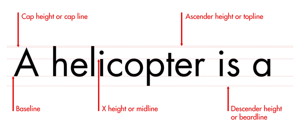
- Baseline: This is the line that the text sits on.
- Cap height (or cap line): This marks the top of capital letters.
- Ascender height (or topline): This line shows where the top of letters such as k and h touch. Strangely, in a lot of cases, this line is slightly higher than the capital line. It took me a while to get this into my head because, intuitively, you would think that capital letters would be the tallest characters.
- X-height (or midline): This shows the height of lowercase letters (excluding ascenders and descenders). It is typically measured using the height of the letter x.
- Descender height (or beardline): Descenders are the parts of characters that go below the baseline (such as the letters p and y). This line shows where the bottoms of the decenders are.
Basic Definitions
Leading – Adjusting the space between lines of text

Kerning – Adjusting the spacing between two individual letters in a word. Some fonts have been so well designed that all possible combinations of letters are balanced and wont need to be adjusted by designers. But sometimes you get a word that needs to have adjustments to the spacing between specific letters. It takes practice to be able to see where kerning is needed. It is a good idea to look at all of your larger fonts and see if kerning is necessary. Usually body text does not need it.

Tracking – Adjusting the space between all of the letters in a word simultaneously.
![]()
Basic Type Classifications
Serif
In typography, a serif is a small line attached to the end of a stroke in a letter or symbol. A typeface with serifs is called a serif typeface (or serifed typeface). The oldest typefaces are serif typefaces. The most used serif is probably Times New Roman. Some say that the serifs on letters helps lead your eye into the next word. Serifs can be difficult to read at times but are generally great for larger or smaller text.

Sans-Serif
In typography and lettering, a sans-serif, sans serif, or gothic type is one that does not have extending features called “serifs” at the end of strokes. Sans-serif fonts tend to have less line width variation than serif fonts. In most print, they are often used for headings rather than for body text. They are often used to convey simplicity and modernity or minimalism. The most used san-serif is probably Helvetica.

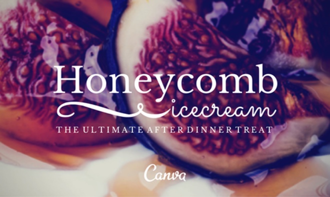
Script
Script typefaces are based upon the varied and often fluid stroke created by handwriting. They are generally used for display or trade printing, rather than for extended body text in the Latin alphabet. Some Greek alphabet typefaces, especially historically, have been a closer simulation of handwriting. Make sure when using script fonts that the font is legible. Also, using this font-face at a larger size is always helpful.

Decorative
Also known as Ornamental or Display fonts. Decorative and display fonts are fonts with extreme features such as swashes or exaggerated serifs, and any fonts designed to be used at larger than body copy sizes. (since most decorative typefaces are not very legible at smaller sizes).

Choosing The Right Font(s) For Your Design
Typeface selection is not a random process. Merely searching through your font catalog to choose a font you personally like rarely creates a good result. This is because there’s a psychology linked to certain typefaces.
When designing, you need to make sure your type is connecting to your audience. This is more than just making certain that your copy is impeccably written for your specific audience. It’s also about ensuring that the font you use fits your market.
You wouldn’t use elaborate and rainbow-colored fonts for a law firm brochure, right? That would be better suited for a birthday invitation:

Free Font Websites
When possible, use free fonts. They are everywhere. Just make sure you go to a legitimate site. I always check the URL on the website to make sure it makes sense. Sometimes you can get weird sites that your should not be using. You can download fonts from these websites and install them into your fonts on your computer.
- Font Squirrel
- Google Fonts
- DaFont
- FontSpace
- Urban Fonts
- Adobe Fonts – this comes with your subscription to Adobe software products. You don’t need to download anything here.
General Rules of Thumb
- Headlines should be large and placed prominently on the page. Conventionally headlines are at the top of the page, but they do not necessarily need to be there. Once you get comfortable with design you can experiment with breaking the rules of convention to come up with unique design choices.
- Make sure that all of the typefaces you use are legible! Some are not and readers will not consume the message of your fonts if they can’t read them. Whatever you design, make sure people can easily read your message. This means dark text on a dark background is a big no-no. Even worse, avoid using a small font over a high-contrast image. You can have a striking design, but all your efforts will go to waste if your text is unintelligible.
- One of the common mistakes designers do is using too many fonts and styles. If you need more than one, make sure to limit your fonts to just two or three typefaces. Use one font and size for the body, another for the header, and another for the subhead. Don’t hesitate to choose fonts from different typeface families, as long as they are cohesive and complement each other.
- Avoid stretching fonts! This is a very simple rule often overlooked by many designers, even the pros. In general, fonts are created with meticulous attention to the details (shapes and measurements) of every letterform. Stretching a font takes away its design attributes.
- Font pairing is essential to the legibility of your design. When you have a heading with a subhead, having two different fonts that compliment each other is a great way to differentiate the hierarchy. The difficulty with font pairing is that you don’t want to have two conflicting fonts or two fonts that are so similar, you can barely see a difference between the two. You want to make it as delightful on the viewer’s eye as possible.
Examples of successful font pairing:


Handy Font Infographic

Avoid the following fonts – Papyrus, comic sans, Curlz, Biner, and Kristen! The video below is great for a laugh. It makes a lot of Graphic Designers laugh.
Informative Video on Typography
